This post dives into the map colors that are used on maps worldwide and what they represent.
Though different types of maps may use more colors or various shades of colors to show details about an area, most maps worldwide follow a set primary color scheme when identifying physical or man-made features.
Map Colors
Maps may have more or fewer colors depending on what they are representing, but typically, the following six colors show the same topographical features across maps:

BROWN: CONTOUR LINES AND ELEVATION
Brown may also mark historical sites, military bases or reservations, national parks, sand, and deserts.

GREEN: VEGETATION
Forests, parks, land reservations, woodlands, orchards, vineyards.

BLUE: WATER
Lakes, rivers, streams, ponds, oceans, water drainage or reservoirs, marsh or swampland. Blue may also represent major highways and local borders. Blue contour lines may indicate glaciers on certain maps.

BLACK: MAN-MADE OBJECTS
Black is used to mark trails, roads, cultural destinations, cities, bridges, railroad tracks, and buildings.

RED: TRANSPORTATION AND RECREATIONAL AREAS
Red also marks man-made features like highways, land/city boundaries, campgrounds, picnic areas, special-interest destinations, military sites, capital cities, urban areas, and airports.

PURPLE: UPDATES TO THE MAP
Though less commonly found on maps today, purple lines indicate revisions or updates made to an original map.

YELLOW: QUADRANTS AND BOUNDARY LINES
Yellow is used only to distinguish areas of a map. You'll often see coordinate grids marked in yellow.
Maps of Boulder, CO courtesy of the U.S. Forest Service
Other Map Elements
Beyond colors, cartographers also include symbols, scales, and grids on maps. These essential indicators are used to identify notable geographical features within an area.
☆ SYMBOLS
Like colored lines, maps include different colored symbols that represent various natural and man-made features. These symbols are used to mark an important feature without muddying up the map.
Symbols can mark things like dams, rapids, waterfalls, mines, capital cities, bridges, wooded areas, airports, wetlands, and more. To tell what a symbol is, you can look at the map’s “Legend,” which is a comprehensive guide detailing what each symbol represents.

📏 SCALES
Maps are created “to scale,” meaning the total area they represent is like a minimized version of reality.
Scales are included on maps to measure the distance between two points. That distance can then be used to calculate real-life distance in miles, kilometers, or whichever measurement you prefer.
The legend provides the measurement used in the scale of the map.
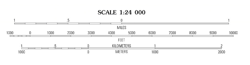
There are typically three types of scales used for measurement on a map:
- Fraction Scale (most common): a ratio is used for measurement. To get the true distance, the ratio will need to be converted using the information listed on the Legend.
- Bar Scale: the bar length represents the true distance.
- Verbal Scale: verbally details the scale, like stating “1 inch on the map is actually 5 miles.”
When looking at maps, keep this in mind: larger-scaled maps provide more detail because they're showing a smaller area, while smaller-scaled maps show less detail because they're providing the "big picture" of an area.
⤧ GRIDS
Maps usually include grid patterns, which are a series of numbered lines.
These lines are longitude (vertical lines that run north-to-south of the equator) and latitude (horizontal lines that run east-to-west of the equator).
- Longitude Lines: measured against the prime meridian, which is an imaginary line stretching from the north pole to the south pole. The farther east or west you go from the prime meridian, the closer you get to 180 degrees (or -180, depending on the direction you go).
- Latitude Lines: measured against the equator, which is an imaginary line labeled as 0 degrees running east-to-west. As with longitude, each line north or south of the equator increases or decreases, ending at 90, or -90.
The lines crisscross, creating a grid that makes up a collection of squares and rectangles on a map. These boxes can be used to help pinpoint specific locations on a map by providing their correlating longitude and latitude numbers (also known as geographic coordinates).
 Latitude and longitude lines are in yellow.
5 Types of Maps
A variety of cartographers (i.e., mapmakers) and publishers create maps, yet most maps adhere to the same color scheme that’s recognized worldwide for indicating land features. Depending on the type of map, one may detail more of a certain type of feature over another, as not all maps depict the same things.
Below are five of the most common types of maps, how they differ and what their colors often mean.
1. GENERAL REFERENCE MAPS: USED FOR TRAVEL AND TOURISM
A general reference map (or a planimetric map) is like a travel map, such as an atlas, wall map, or road map. Think of the type of map folks used to use while driving cross-country back before Google Maps was a thing.
These maps are mostly used to get you from point A to point B, but they can also be a great option for tourists who are looking to scout out all the major attractions in an area.
General reference maps are easy to navigate and detail major features of an area like highways, street names, parks, bodies of water, national parks, and historical landmarks.
General reference maps follow the same color scheme outlined above. But, instead of contour lines, general reference maps are more likely to use simple color shading to express elevation.
 Tourist maps are considered General Reference Maps
2. TOPOGRAPHIC MAPS: USED TO INDICATE ELEVATION CHANGES
Topographic maps—also known as contour maps—give an in-depth, 3-dimensional look into the “lay of the land.” They use illustrations, symbols, colors, and contour lines to detail the landscapes’ natural and artificial features (elevation changes, bodies of water, roads, trails, areas of rich vegetation etc.).
Anyone who needs to analyze an area's geographical features and elevation changes uses these maps (hunters, hikers, architects, engineers, city planners etc.). A hiker that knows how to navigate using a topographic map and a compass has a strong survival kit in their back pocket.
Here are some basics to read and understand contour maps:
- Each contour line marks land that sits at a specific elevation above sea level.
- The closer the lines are together, the steeper the elevation change.
- The farther apart they are, the more gradual the climb will be.
- When lines get closer together and begin to form small circles, the smaller, innermost circle represents a mountain peak.
Topographic map colors follow the color scheme outlined above, too. Contour lines are marked in brown.
 A topographic map. The brown lines reflect the terrain's elevation.
3. THEMATIC MAPS: USED TO DEPICT LOCATION-BASED DATA
Instead of providing a big-picture view of an area, thematic maps (otherwise known as "special-purpose" maps) represent a specific detail of a geographical location.
This could be the area's geological makeup, its soil type, its average precipitation levels, a location's population density, crime or health stats, or other measurable information.
Thematic map colors differ to the scheme above. They often use color shading to represent stats: lighter shading to show smaller amounts, and darker shading to show larger amounts.
 Thematic maps are commonly used by the U.S. Census to translate statistics visually
4. NAVIGATION CHARTS: USED FOR MARITIME NAVIGATION
Navigational maps used for water travel are referred to as “charts.” For mariners, nautical charts are key navigational tools used to safely maneuver through bodies of water.
They have a uniform system of symbols and abbreviations that detail important environmental features like water depth, hidden rocks, shipwrecks, warning notices, aid stations, lighthouses, and buoys.
Navigational map colors differ slightly to the color scheme above as the focus is on navigating through water. Shallower water is shown in blue and deeper water in white. Green marks areas affected by the tides and yellow marks the land.
 by Dale Simonson (CC BY-SA 2.0)
5. CADASTRAL MAPS AND PLANS: USED TO MARK THE LIMITS OF A PROPERTY
Cadastral maps are used to keep a record of land ownership. They outline property boundaries of a home, business, or plot of land. They contain plot numbers that represent ownership which is used for taxation purposes.
Cadastral maps aren’t usually as colorful, various colors can be used to mark boundaries and different types of development.
⏭ Read next: How to Read to Topographic Map

 650-Calorie Fuel